ABHI'S new, CRM-integrated website
Success achieved
The launch of a member-focused website, increasing engagement and better highlighting the work of the association and sector.- Website
- https://www.abhi.org.uk
- Project dates
- November 2014 - May 2016
Project team
- Nishan Sunthares, Chief Operating Officer
- All personnel in the association
Tools & Systems
The new website is designed with Umbraco. On the home page of the website, visitors can choose their area of interest from a dropdown box.
The CRM system is called Integra and an API allowed the website and the CRM system to talk to each other.
Members can now log in and they have a portal with useful member-only information. However, some simple changes have reduced the need to log in (research showed this was viewed as a frustrating and unnecessary step for some members).
For example, member emails traditionally included hyperlinks to the member section of the site. This created frustration for those who couldn’t remember their log in details, or who wanted to share the information with colleagues who may not have a log in themselves. This barrier and excessive clicks meant time was spent for a small reward.
The content is now uploaded twice by ABHI: once to the member area and once to a unique URL. This URL is sent on all member emails (as only members are on the distribution list) so they don’t need to log in each time. It is a much-improved experience for all.
Introduction

The previous ABHI website was dated in design, and the layout and content did not meet stakeholder needs. The look and feel did not accurately reflect the MedTech sector nor did it convey the value that the sector brings to the British economy or positive impact upon patients’ lives.
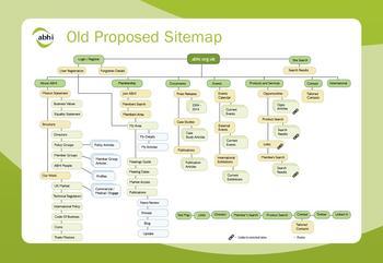
There was no personalisation on the website, and content was disorganised. It was challenging to locate useful content, and even if the content was found, it was often hidden behind a member log-in page (which created a barrier to those who had lost account details).
Information was presented in a text heavy format and images were static and product-focused.
Discovery
Research was comprehensive and took time to conduct:
- A quantitative survey was sent to all those on the CRM database (both members and non-members) to gather feedback on the current website and other integrated communication tools (such as emails).
- We segmented members into five personas and decided to research each separately to identify their wants and needs. This would help structure content, identify appropriate platforms and important features for each. A number of face to face in-depth interviews were conducted, alongside usability testing of the old website. New website design proposals were also discussed.
-
Once the feedback was incorporated into the new site, we returned to those members for further feedback and optimisation.
-
Upon completion of the new site, these members were invited to ‘test’ the site and suggest further ideas.
-
Internal staff were also engaged. Staff meetings were called to convey research results. Staff were surveyed separately to gather their ideas. Staff were also encouraged to take ownership of certain parts of the site.
-
An analytics expert was consulted, to better understand customer journeys and site navigation.
-
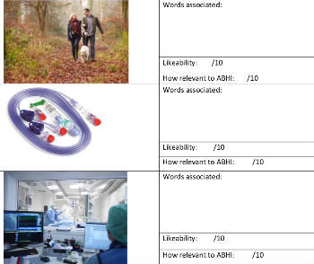
A sample image library was created, both staff and members were invited to feedback on these to identify appropriate imagery for ABHI (Figure 1). This led to image sourcing and creation through two photo-shoots, stakeholder engagement and some stock pictures.
Research showed that members used the content of emails and the website in differing ways – many wanted resources to be sharable and in a variety of formats. They also wanted to have a one-stop-shop for all resources for a specific topic. Navigating the internet to find relevant information was time consuming. Analytics showed site visitors spent a lot of time ‘searching’ for a destination or topic.
Objectives
We wanted to increase member engagement through the website. We wanted to improve repeat visit rate by 10%. Other metrics we agreed to look at were bounce rate, duration of visit on the site and number of pages viewed per visit. These are all indicators of online engagement.
Timeline
The project took place over eighteen months.
See the example schedule attached in the Related Files section.
Activities
Designs
The initial website designs were created alongside initial member research and engagement phase.. These were used as discussion points with selected members to gather feedback and further improvements.
Image research

Telephone interviews were conducted with members, alongside a staff survey to determine which type of images best reflected ABHI. A ‘menu’ of photos was created, and word association technique employed to gather opinions. Each was rated for likeability and relevance too (see attachment for example).
A number of methods were employed to put the theory and research results into action. A photo-shoot was organised to capture appropriate imagery. Members were encouraged to submit pictures of their products in use. Partner organisations supplied some pictures, and some stock photos were purchased.
See the full image market research in the Related Files section
Member research
Comprehensive research enabled ABHI to adopt a data led approach to most decisions. Although this took time and resources, the resulting website better met member needs and wants. Survey Monkey was used for research, Mailchimp delivered the research emails, all in depth interviews were recorded and a trained interviewer (Katryna) conducted interviews over the phone or face to face. For face to face, software was used to record mouse and eye movements of the participants, to capture UX information. Crazy Egg provided heat mapping and visitor insights information. Google Analytics was used to set targets and determine what worked well and what required improvement.
Member segmentation
Members were segmented into five groups, and these groups were all represented in the research. This allowed ABHI to ask persona-style questions to determine their individual aims, needs, preferences and requirements.
Content
The entire website was re-written. Staff were engaged and encouraged to take ownership of their respective areas of the website. Guidelines were produced to help with content creation and answer common questions. A copywriter was used to ensure all content had a similar tone and style to accurately reflect the ABHI brand.
In addition, a number of partner organisations were contacted to request the sharing of content. The ABHI resource hub curated and hosted an improved source of industry information. In addition, a content plan was produced so that ABHI can plan ahead, have relevant themes and cater for the varied member needs through a selection of formats and templates. Staff were upskilled to allow production of in-house videos, capturing the value of day-to-day activities in creative and inspirational ways. It also allowed engagement with a large number of geographically dispersed members easily, at their convenience.
Many links have been made, and in the ‘back end’ topics are selected to ensure visibility across pages of the site. For example, if you are reading about the ‘accelerated access review’ under the ‘what we do’ heading, on the right-hand side of the page there are a number of other related website resources linked here which are relevant to the topic (very similar in nature to the ‘you may also be interested in....’ feature on sites such as Amazon). The ABHI staff ‘owner’ of this topic is also shown, so additional queries can be directed appropriately and addressed quickly.
We took a lot of time contacting numerous partner organisations (such as NHS Confederation, Kings Fund, Scottish Enterprise) to allow us to create a ‘resource hub’ for the industry. This collation of materials in a variety of formats can be easily filtered, searched and navigated.
Formats of content are changing to meet member needs. Templates for case studies, explainers, videos etc have been produced to allow consistency of brand and content, and encourage new ways to convey information. This has created further challenges (such as video production skills and equipment), but ABHI has embraced these and invested in upskilling staff, purchasing editing software and recording equipment to enable member needs to be met. ABHI are continually adding to the user experience and optimising what is already there.
Site users are quickly and easily updated, gaining knowledge from a number of sources, each with differing viewpoints and knowledge bases. For example, if a member wanted to know about the impact of Brexit on the sector would find resources from not only ABHI but also NHS Confederation, NHS European Office, the Brexit Health Alliance, Nuffield Trust and the Health Select Committee. This takes just two clicks from the homepage to show all Brexit results, and the most recent resources are available in just one click (on the homepage).
Activity planning / Scheduling
A simple gantt chart of activities was produced after the research stage to manage delivery.
Ongoing maintenance & development
To ensure the website remains up to date and continues to meet member needs, an organisation-wide quarterly review has been established. This is in addition to the regular updates conducted by the communications team. The continuing focus on the impact of the website and it’s use as a valuable member tool ensures that the culture is embedded in the organisation, and that staff keep the website and members at the forefront of their minds.
Innovation
ABHI took a data-led approach to the redesign, putting the members at the heart of everything for the new site. Two photo-shoots captured appropriate imagery for the site. The project has impacted so many other activities. For example, a new email platform was adopted to allow for greater control over communications, templates and integration with the new website. Obstacles were seen as opportunities for growth and development and have led to many improvements.
It is unusual to re-write an entire site. Not one page of the old site was copied – every image was fresh, each piece of text new. A challenging task which required co- ordination and planning. Members can really see the value now - the site is consistent in tone, style and approach. Content is up to date and relevant and, crucially, meets their wants and needs.
Marketing
The new website has been promoted via direct emails to those in the database. Also the content on the new site is promoted through the ABHI social media channels (LinkedIn and Twitter).
Social media is scheduled through Hootsuite. Partner organisations have helped drive website traffic, through sharing newly produced video content on their channels or networks. The website is also promoted in hard copy literature and event/exhibition materials.
Challenges
Project-managing content creation was a constant challenge. In practice, managing and encouraging the entire workforce to be actively involved and take ownership of their areas of expertise proved challenging. We used software for all staff to upload their content onto the website and at times it became confusing to remember who had submitted what (especially as more than one version was sometimes submitted).
Achievements
We achieved and even exceeded all objectives. We wanted a 10% increase in visitor numbers, but achieved 30%. All metrics measured showed a dramatic positive increase – so we were delighted.
Website visitors can easily navigate the site.
Targets & Statistics
Measuring against our original objectives (regarding member engagement) here are the outputs:
- 30% increase in returning visitors
- 66% increase in session duration (3.17 vs 1.58)
- 18% reduction in bounce rate
- 57% increase in pages viewed per session (4.06 vs 2.59)
These results are for a three-month period (the same period each year) for the old and new website. Results far exceeded initial expectations and targets.
Financials
The total cost was £30,000. No additional staff were employed, but consultants or agencies were used as experts where required.
What would we do differently?
We could have used a quick and easy way to check deadlines were met and momentum maintained.
The time it took to deliver – in an ideal world we would have launched sooner. However, we took a strategic decision to delay launch to allow for further research to take place. We believe this was the right approach, as it meant that when the site was finally launched it was a vast improvement on the old site.
Feedback & Testimonials
We have heard from key members and some feedback highlights are below:
“The resource hub one of the most comprehensive and valuable collections of information in our sector. I make this the first port of call for researching all industry topics.”
“The new website looks much sharper. I really like the Resource Hub and the new design to click-on for more”
“Huge improvement, clean & simple, not too busy.”
“Good topic range, really nice.”
“Clear. I like the headings and areas of interest”
“Straightforward, easy and user friendly”
We also did a simple rating comparison with some members (old and new website) and the ‘overall satisfaction’ improved from 3 out of 5 to 4.5 out of 5.
Wider impact
The website has been an accelerator and driving force behind some greater strategic cultural change. This is being taken a step further through research to investigate the brand as a whole and the value the organisation delivers. The opportunity to reassess and enhance the member offering is being seized. As this project was such a success, it makes sense to take this approach to all operations.
Because of the comprehensive array of resources on the new website, members are better informed and equipped to do their jobs more effectively. The ABHI website has become a platform for the sector, hosting resources from numerous organisations in one place.


